the business shoe that moves
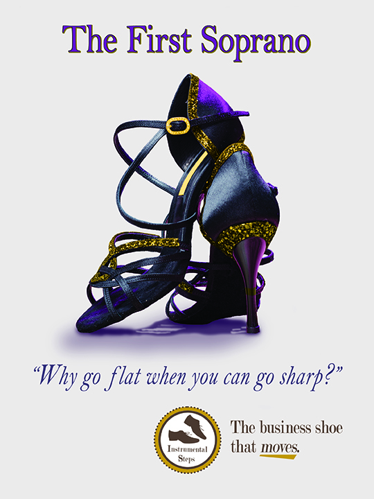
Main advertisement meant for a magazine.
There are few projects that I look back with absolute satisfaction because of how well it turned out.
While some of my later projects can arguably be said to be of better “quality” as far as techniques applied, it’s the projects where I know I spent every sensible hour editing and designing the project that I share with confidence.
“The First Soprano” is one of those projects.
Inspired by how I use my University of Delaware marching band shoes as dress shoes, and how dance shoes bend and move with the feet—instead of containing them—I wanted to offer those in the office world something fun.
Unlike most design processes, I didn’t begin with sketches but with images. Us students could only create the ads with either pictures we took or free stock images. Only after I found a pair of women’s shoes and men’s shoes I liked, the sketching began.
The evolving sketches led to a naming showdown between The Tenor/Baritone and The First Soprano. I’m sure you can guess which concept was the strongest, and thus came out victoriously.
I had the concept, the product title, and eventually a catchy tagline. And even though I didn’t have to, I also created a fictional shoe company that would best fit my campaign. It was all coming together.
The only thing left to do was create the design.

Small internet banners do not do well blown up for all to see.
Everything seen here was created in Adobe Photoshop with a mixture of destructive and nondestructive editing. The purple was pulled from the shoe’s natural colors and enhanced, while the gold was added via a color overlay mask, as the original shoe trim was silver, which I did not care for. The shoes already had a shadow, but I didn’t know how to keep it intact since the image’s original background was a dance studio floor. So, I used various brushes to recreate the shadow using brand colors. This also gave me the freedom to give the shoes a real presence by darkening the contact shadows and creating longer and softer cast shadows.
Once the main advert was done, we were tasked to throw together two web banners for the top of a website and mobile phone, as seen above and to the right.
All-in-all, this final project of my raster graphics class is still one I’m very proud of. And while I would definitely approach this campaign much differently as a more experience designer, I can never go back to that intensity and focus that comes from being a newbie.
My favorite part of looking back at this time in my studies, I can see foreshadowing of my personal design tastes and branding style; clean design, strong opaque colors, a kitschy tagline, and a conservative use of gradient.
Who knows? Maybe it’s time to revisit this campaign and give my soprano her tenor.
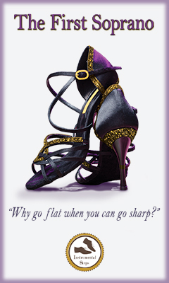
Mobile ad sans company slogan.